Canvas Panels

New Traditions Art Panels Inc.
Oil Primed Belgian Linen Fine weave
L600 - 1/8 inch Birch
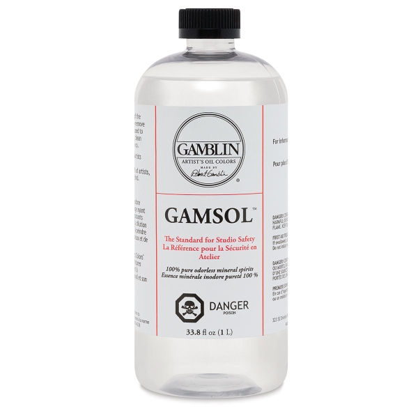
Paint Thinner:
Gamblin Gamsol Odorless Mineral Spirits
|  |
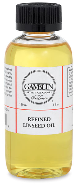
Medium:
Gamblin refined linseed oil
|  |
Canvas Panels: Oil Primed Belgian Linen Fine weave
Or, wood board (birch) primed with Gamblin Oil Ground |
L600 - 1/8 inch Birch
New Traditions Art Panels Inc.
3006 South Scott Lane #101
West Haven, UT 84401
801-732-0208
|
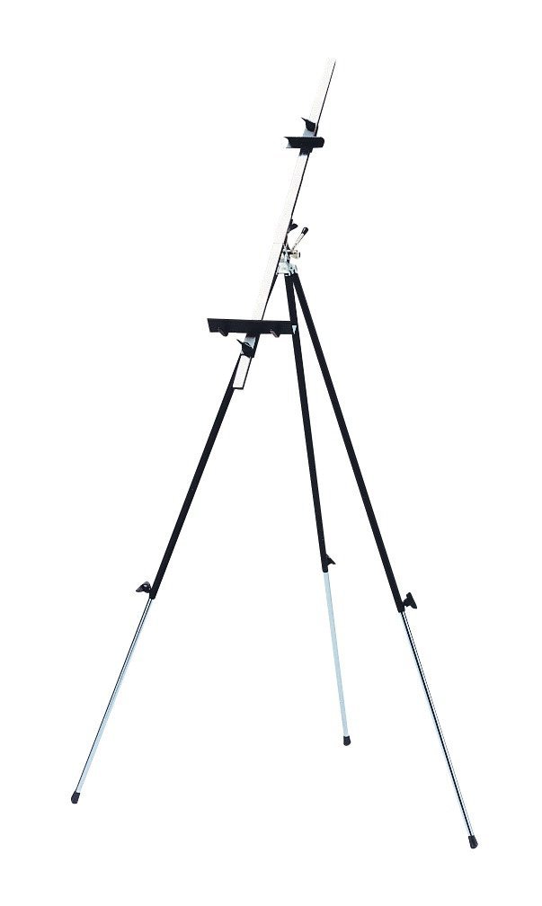
Easel:
Jack Richeson 694051 Italian Field Easel, Steel, Black
|  |
SoHo Grey Toned Disposable Paper Palettes
|  |
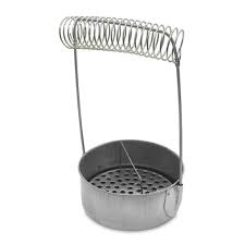
Brush washer
|  |
Palette knife (Diamond shaped, steel)
|  |
VIVA paper towels
|  |
Brush soap
|  |
Oil Paints
My basic palette includes 13 tubes:
| |
Lead White: Thomas Harding Lead Stack White
Warm, velvety, lustrous white great for flesh painting.
|  |
Titanium White: Gamblin
|  |
Burnt Umber: Old Holland
Beautiful flesh shadows when mixed with cadmium orange or ultramarine.
|  |
Raw Umber: Old Holland
Transparent with cool green undertones perfect for underpainting, block-ins, grisaille and wipe-outs
|  |
Permanent Alizarin Crimson: Gamblin
Transparent cool red perfect for flesh tones, makes a rich black with Sap Green + Ultramarine
|  |
Cadmium Red Light: Old Holland
|  |
Cadmium Orange: Old Holland
Mix with Cerulean Blue to make a rich grey
|  |
Lemon Ochre: Williamsburg Paint
Superior yellow ochre without heavy green undertones
|  |
Cadmium Yellow Light: Old Holland
|  |
Sap Green: Williamsburg Paints
Transparent, cool and rich, great for flesh painting and landscapes.
|  |
Cerulean Blue: Old Holland
Versatile warm blue for landscapes, makes a rich gray with Old Holland cadmium orange.
|  |
Cobalt Blue: Old Holland
|  |
Ultramarine Blue: Old Holland
Transparent with green overtones, great for under-paintings and transparent shadows, mixes with Sap Green + Alizarin to make a rich black.
|  |
Manganese Violet Reddish: Old Holland
|  |
Black:
Mix Sap Green + Permanent Alizarin Crimson + Ultramarine Blue for a rich transparent black.
Mix Burnt Umber + Ultramarine Blue for a rich opaque black.
|  |


