Thursday, January 29, 2009

Still Life Painting Process

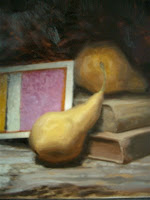
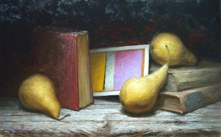
"Purple Palimpsest", 2009, 11 x 18 inches, oil on board, by Thomas Shelford

In this post I'll walk through the making of a still life painting called "Purple Palimpsest". Click on the photos below to see larger close-ups. This still life process is a combination of 17th / 19th century techniques and is inspired by contemporary painters such as Jacob Collins and Kate Lehman. The use of a multi-step "indirect" painting process allows the artist to focus attention on executing one aspect of the painting at a time, isolating rather than juggling the many complicated variables such as drawing, composition, application, hue, value and chroma.

The Concept
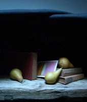
In this still life painting I'm arranging pears, books and a postcard of a favorite Mark Rothko painting in a geometric configuration, with the postcard setting the overall color scheme. The center of interest occurs at the intersection of the fully lit postcard and the principal pear. The concept behind this piece is to create a visual vocabulary that will hopefully communicate the following things:
  • On a narrative level, make an art historical statement that tries to integrate the legacy of modernism with the recent resurgence in 19th century-style realism.
  • On a visual level, explore the relationship between abstraction and representation by "re-contextualizing" an image of an abstract painting through the device of executing the image in a traditional format.
  • On a symbolic and philosophical level, explore the relationship between the intellect (represented by the sparse geometry of the Rothko postcard and the books) and the sensual world (represented by the anthropomorphic pears and the driftwood board), and examine how the two can be integrated in a harmonious, balanced, and beautiful way.
The Setup

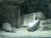
Various configurations of the still life objects are tried, with small charcoal sketches made in order to test out the composition. After several iterations, a final setup is selected based on the charcoal compositional sketches. The setup is done under a natural north light skylight with black felt creating a "box" around the objects to control lighting and obtain a chiaroscuro effect of forms emerging out of the dark, after the example of a 17th century Caravaggio or Zurbaran painting.


The Poster Study


In order to arrive at a final color scheme, small studies are made in oil, massing in the average hue/ value/ chroma of each large shape in a "posterized" version of the painting. The sketch is made working from dark to light, painting each shape side by side rather than jumping around, so that comparisons can be made and each brushstroke can be judged for temperature ("is it too warm or too cool?") and value ("is to too dark or too light?"). Successful color combinations are saved as swatches on a piece of canvas and labeled for reference with the colors that were used. This swatch sheet becomes the basic reference palette of the painting and is used to mix the major strings when the final painting begins.
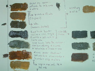

("Poster Study", 4x6 inches)


(Color swatches from poster study)

Drawing:

A graphite line drawing is done from life in order to ensure simple, organic, harmonious relationships between the large shapes and sweeping lines of action. Proportions are established through comparative measurement and viewing the drawing in sight-size to identify proportional errors and speed up the drawing process. Photography is not used because it can result in a flat, "cut-out" looking drawing and is subject to the "fish-eye" distortions of lens curvature. The drawing consists of an "envelope" or "block-in" of the objects with the separation between light and shadow (the "terminator" line) indicated. No modeling is done in the drawing, and only the broad sweeping line movements are indicated. The drawing is kept at a simple "blocky" stage so that there will not be a temptation to "tighten up" during the painting process in order to avoid losing small drawing details.
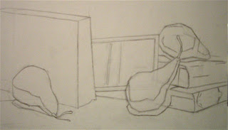
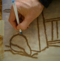
(Block-in graphite drawing)

Transfer

The drawing is then transferred to a sanded birch board that has been primed with Gambiln's white oil ground in a succession of thin coats, and then covered with an imprimatura ground layer of raw umber that has been thinned with odorless mineral spirits. The transfer is done by tracing the drawing onto tracing paper, covering the back of the tracing paper with raw umber oil paint, placing the tracing paper face-up on the painting surface and going over the lines with a ball point pen to make an impression through to the painted side of the paper.

Open Grisaille

Once transferred, an "open grisaille", (also called a "wipe out" or "imprimatura") is painted using raw umber for the darks and the white of the board for the lights. (This as opposed to a "closed" grisaille which uses white paint for the lights). The advantage of the "open" grisaille is that the reflective surface of the board shows through, and creates an effect of glazed luminosity when light is shown on the painting and it reflects back to the viewer through all of the paint layers.

The open grisaille establishes a crude value structure, locks in the drawing using paint, and leaves loose edges if large bristle brushes are used. The transparent raw umber creates atmospheric effect which will show through in the dark areas of the final painting. The raw umber is applied with large bristle brushes and the light areas are created by scraping away the paint to reveal the white board surface. Thinner is used as needed to cut through the paint and expose the white ground of the board. It is very helpful to use bristle brushes that have been cut down to create a scraping tool that will etch through the paint.
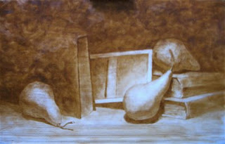

("Open Grisaille" in raw umber)


Ébauche or First Pass:

The first pass consists of a thinned layer of paint which is mixed to a slightly darker, less chromatic "average" color for each major plane visible in the objects. This creates a baseline "context" of color against which subsequent brushstrokes can be judged. By mixing a lower contrast, dull or "dead" palette, there is plenty of room or "range" left to add chroma and value in later stages of the painting.

Strings of paint (ranging in value from the darkest to the lightest visible) are mixed based on the poster study swatches. Each form is simplified into its major planes, as if they are the facets on a disco ball. Paint is applied by "crawling" out across the form, from the shadows towards the light-facing planes. At this stage, the major plane boundaries are delineated in a "choppy" geometric look, not blended together. This will make it easier to identify and correct drawing and value problems at this early stage.

Modeling:

After the first pass has dried, the subsequent passes can be made with the brushes dipped into a "fatter" medium of 2/3 stand oil, 1/3 thinner so that they will sit on top of earlier passes and leave them intact. Once again, paint is applied by crawling out across the form, from the shadows towards the light-facing planes, frequently stepping back from the canvas and squinting to compare the large temperature and value qualities of the painting with life. This is where the bulk of the real painting happens.
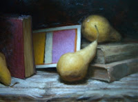
The setup is used as a reference for the movement of form and is not necessarily "copied", as artistic decisions are made, consistent with the desire to create a "convincing" illusion of form and space which will create a more arresting dialogue with the viewer. The setup at this point is being used as a "reference", since the ebauche phase has already established overall value and temperature relationships that are analogous to the relationships that exist in nature.

In order to avoid an "overworked" feeling, each brushtroke is placed deliberately and corrected with a subsequent color rather than by smearing or blending in an attempt to turn form with an airbrushy effect. The shape and placement of each brushstroke should further correct and refine the drawing, and create the desired edges as one stroke is dragged over the next in an overlapping "tile" effect. The temptation to touch the surface more than once with each loaded brushstroke to massage or smear the paint is avoided, as this results in muddy color and murky atmosphere. If each stroke is left intact and corrected with subsequent strokes, the paint application will retain "freshness."

While progressing around the forms, the puddles of paint are adjusted warmer or cooler to make them recede or come forward in space. High contrast and high chroma is used selectively to make forms advance in space and create a center of interest. Edges are adjusted to make objects recede using softer edges, or come forward using harder edges and more contrast.

Usually 2 or 3 complete modeling passes are required and the centers of interest are resolved and developed further than the other areas of the painting. Before each subsequent pass, the painting is "oiled out" by rubbing in the medium gently with a fan brush to bring out the luster and true color.

Finishing:

The highlights are built up with thicker, more chromatic paint. The temptation to use white is avoided as this results in a "chalky" or washed-out look. The center of interest is resolved with additional detail while less important areas are left undeveloped and may remain untouched since the ebauche phase. Paint fattened with medium may be applied as a glaze to simulate surface effects, create translucency or to modify the temperature of a previous layer. Finally, the painting will be oiled out to unify the finish and may be varnished after drying for a year. A frame is selected to compliment the aesthetic of the painting rather than the environment in which the painting will temporarily be displayed.

Tuesday, January 27, 2009

Splitting (Fine) Hairs

The difference between fine art and illustration is an irresistible hair-splitting exercise for figurative realist painters. The term "illustrated" is used by art critics as an epithet to dismiss realistic artwork, just as "decorative" is the pejorative deployed against abstract artists. "Illustrated" seems to have replaced "kitsch" now that realism has made a comeback and powerhouse painters like Odd Nerdrum have successfully pushed back against the k-word, re-defining it in terms of their own agendas.

(Above right: Malcom Liepke's figures have an "illustrated" look.)

I have overheard fine artist and former illustrator Rick Piloco dispatch the question by framing it in terms of intentionality: "illustration is just painting what an art director wants me to paint, instead of what I want to paint." Piloco has a gift for no-nonsense incisiveness, but I propose that there are certain stylistic hallmarks that mark the difference.
The purpose of illustration is to communicate a specific narrative idea, usually contained in the accompanying story or magazine article. Illustrators develop a symbolic shorthand to express narrative ideas with clarity. This is even more evident with cartoonists, who develop a visual vocabulary based on a range of simple shapes that are limited in scope but extremely flexible and able to miraculously convey the full range of human emotion with a few dashed lines. When this symbolic vocabulary surfaces in figurative fine art, the work starts to acquire an illustrative quality or "shtick."

What does a "shtick" look like in practice? Just like the difference between pornography versus an Ingres odalisque, I know it when I see it, and what I'm seeing is the use of symbolic visual shorthand instead of an authentic visual experience. Malcom Liepke's work presents a good case study since it is formidable and not a "straw man" that is easy to knock over as "illustrated." Liepke is considered to be a leading figurative realist, so his work is a valid target for scrutiny. Looking at Malcom Liepke's older restaurant scenes from around 2003, all the figures look the same. The noses on the faces are the clones of the same bulbous shape and exaggerated plummy red. Does Liepke only hang out with people who have colds? More likely, he verifies its orientation and placement among the larger shapes of the face, and drops in his standard nose in an artful copy and paste.


(Above: a delightful scene by Malcom Liepke, with an "illustrated" feel.)

Don't get me wrong, Liepke's narrative figure scenes are delightfully cinematic, playful, with inventive color schemes of complimentary reds and greens. The paint quality is luscious and fresh. But, alas, in my view his work is the essence of "illustrated" fine art. Of course, greenish backgrounds, scarlet lips and puffy roascea is his stylistic "signature" which makes his work recognizable, but to Liepke's well publicized dismay, his visual shorthand is readily copyable. Indeed, a host of second-hand Liepkes have been popping up everywhere (especially in the pages of American Art Collector), each imitator hoping to siphon off his commercial success. Unfortunately for Liepke the copies look an awful lot like the real thing.

This ease of imitation points to the main shortcoming of "illustrative" work: it is formulaic.

A similar problem affects the artwork of many fine art anatomy instructors, who can't resist drawing what they "know" is there rather than interpreting their authentic visual experience.

Contrast Liepke with Jacob Collins. Both are at a similar stage in their careers. Collins paints nude figures in the same lighting, using a limited repertoire of classical poses, under similar studio conditions, yet through diligent attention to his authentic optical experience is able to imbue each figure with an entirely unique psychological presence. The figures have a life force that fills up the room. This careful mindfulness in working exclusively from life allows Collins to be informed by his knowledge of anatomy and conceptual understanding, without falling into the trap of what Ted Seth Jacobs calls "symbolic thinking".


(Self Portrait by Kate Lehman, 2003. A stunning fine art counter-example to an "illustrated" approach.)

This optical naivete, informed, but not overruled, by intellectual understanding is also evident in the quiet emotional power and of portraits by Travis Schlaht and Kate Lehman. The border between illustration and fine art is a hazy one, but the edges of the split hair span a vast chasm between Sargent's subtle anatomical shorthand and the formulaic recipes of many commercially successful contemporary realists.

Saturday, January 24, 2009

Jim Napierala. Nice Modernist.

I must come clean about the fact that most abstract art leaves me about as satisfied as a nice hot bowl of water soup. The flatness is visually uninteresting, the lack of emotional content leaves me cold, the lack of narrative content is a snore, and I'm out the door muttering the "d" word: decorative. Chalk up another yawn on Clement Greenberg's tab.

(Above right: "Fornax Chemica", 2008, by Jim Napierala.)

Yet every so often when I'm expecting a water soup I am served up a spicy gumbo by some nice modernist. Such was the visual fare at Sylvester & Co. in Amagansett which exhibited the abstract paintings of Jim Napierala. Jim is a jovial, engaging gent who has invested a significant amount of craft in developing a series of paintings that combine the visual richness of layered materials with undulating geometric patterns. Paint of varying applications (thin, glazed and impasto) jumps to the fore alongside glinting aluminum leaf to create swirling meditative shapes, which Jim carves into the sandwiched surfaces of his pieces.

The surfaces shimmer and undulate, and the eye is lost in a meditative visual space as it follows intertwining linear pathways. The geometric flux reads to me as a visual metaphor for thought itself, as pleasing spiral patterns emerge, referencing each other, flowing back into themselves, and resonate together to create a macro-rhythm. In some of the pieces an illusionistic depth of field hints at opening up, drawing the viewer into Napierala's meditative realm. Nice modernist!


More about Jim's process:
http://www.biddingtons.com/content/creativenapierala.html

Thursday, January 15, 2009

This Is How We Do It

Here is a video of an amazing drawing demo by David Kassan at the Salmagundi Club in New York City, which illustrates the virtues of working from life, particularly with respect to the harmonious, organic relationships between large and small shapes. This portrait was done in under three hours, in charcoal and white chalk on toned paper. Bravo!!

http://davidkassan.com/demo/demo.wmv

Chelsea Gets Back to the Future

The resurgence of figurative realism which has marked the past decade seems to have kicked into high gear with exhibits by artists such as David Jon Kassan who recently showed at Gallery Henoch in New york City's Chelsea art district.

This is a really encouraging development: my memories of a Chelsea art crawl two years ago featured plastic garbage bags tacked to a gallery wall along with a pile of smashed up ping-pong balls on the floor. As is the custom in these parts, the garbage bags were accompanied by the obligatory essay. The arranger of crushed plastic had been hard at work re-contextualizing the viewer's perception of what art is, finding found objects and leaving the job of making the stuff that actually is art (or might be art if properly "contextualized") to less "discursive" folk.

A big relief it was then, in September of 2008, to see the likes of David Kassan's solid figures posed against graffiti- scarred concrete walls. Kassan's chunky, visceral build-up of paint in the lights points in the direction of Rembrandt's emotional heaviness. An obsessive attention to the topography of flesh lends gravitas to the subjects. The gritty urban backdrops echo the grooved textures of flesh and neatly marry abstraction and realism. The result is a figurative oeuvre that is contemporary to its bones, but stands confidently on the shoulders of past giants.

David Jon Kassan Web Site:
http://davidkassan.com/

Gallery Henoch:
http://www.galleryhenoch.com/

Wednesday, January 14, 2009

An Empire of Flatness

A question often posed to artists who paint the human figure from life:

"Why don't you just take a photograph?"

The relationship between photography and painting has become a complicated and interesting one as Hyperrealists execute impressive technical feats through software-assisted "human laser-printer" activities worthy of an android. Digital imaging technology provides an unlimited range of settings for the figure, liberating artists from the confines of what is possible in studio setups.

Yet, in spite of all the technology that money can buy for art star Photorealists like Damien Loeb, figure painting based on photography often reads as emotionally shallow, lacking the organic harmony and psychological center of interest necessary for that elusive feeling of "life energy" in an image. Photo-based figure painting is often executed in a manner that is airbrushy, uniformly resolved, undifferentiated, flat.

Contemporary Photorealists employ a process somewhere in between photography, digital graphic design and painting. The totality of the visual experience has been converted into an abstraction by the machine which the artist then re-interprets and enhances, working in a place several steps removed from the orginal visual experience.

The prevalence of photo-based figurative painting has created a new Empire of Flatness in the contemporary art world. "Exploring the flatness of the picture plane" was a mantra of mid-20th century modernists, but this recent plague of flatness seems to be an unintentional by-product of a painting process that is derivative of the two-dimensional low-resolution digital image.

Most accomplished figurative artists who work from life develop the uncanny ability to immediately identify a figurative image that was based on a photograph, even when looking at an image of the artwork in a catalog or brochure. The figure often has the feeling of a "paper cut-out" which has been pasted onto the background. Digital images exaggerate reflected lights, and flatten form against the background. Gallerist Laura Grenning, for example, has elevated this ability into a virtual mind-reading parlor trick, which I've seen her deploy to expose the working methods of aspiring figurative realists with nary a 10-second glance at their portfolios.

So, then, what exactly is the "secret sauce" of life drawing that gives it the organic and emotional energy lacking in photo-based figure painting?

Life drawing entails the gradual creation of an image slowly over time, through the accumulation of thousands of marks which are related to each other through a process of intentional artistic decisions. The gradual accumulation of marks over time, creating a cast or mold of thousands of movements of the artist's body, results in an image with these features:

  • Psychological Focus. We see with the mind, and our attention focuses on visual elements that convey emotion. In life drawing this center of interest will naturally emerge as some areas of the painting are resolved while other areas remain loosely indicated. The camera, however, does not differentiate between an expressive mouth and an earlobe. Everything within its focus is resolved and given equal attention. There is no psychologically-driven hierarchy of interest.

  • Organic Harmony. With each mark, the artist builds the image by establishing relationships between the parts and the whole. In classical figure drawing, this happens through a deductive process, as relationships between large shapes are established before the smaller component shapes are drawn. Connections are found between gestural lines that run "though" the form. This process is destroyed by tracing an image that has been projected onto a canvas and then traced.

  • Gesture. A sense of motion is conveyed in life drawing through the accumulated selection of thousands of tiny moments that are layered together, as the artist patiently waits for the model to settle into a particular position or for the light to catch a form in a certain way. Line and edge quality leaves indeterminate borders between the form and the space around it, creating a sense of energetic movement.

And now for an exception. Many artists who have been extensively trained in life drawing methods are able to overcome the limitations of the photo-derived image and imbue their subject with the life force that the camera normally sucks out. A contemporary example would be Alyssa Monks who uses color temperature and a Venetian glazing process (along the lines of a red imprimatura -- terra verte grisaille -- dead palette first pass -- modeling with glazes and heavy scumbling) to turn form and compensate for the flattening cut-out effect of photography. In her other paintings, Monks has used screens and veils (water, shower curtains) to break up the image and scatter edges into blurred geometries, avoiding the pitfalls of stiff photo-based drawing by virtue of her choice of subject matter.


"Penance", 2006, by Alyssa Monks, oil on canvas, 54 x 72

Digital photography liberates the figurative artist in terms of subject matter, but paintings based on the digital image consistently fall short of expressing the undeniable life force that is visible in this painting by Jacob Collins. His work "Anna," painted from life, powerfully illustrates the advantages of working from an authentic, original visual experience:


"Anna", 2004, by Jacob Collins, 36 x48 inches oil on canvas

Tuesday, January 13, 2009

Even more than a pipe, a beard makes a fellow look wise.

This is one reason why I keep coming back to Tolstoy's ideas, like this (paraphrased) definition of art:

Art is the inspired exercise of a craft for the purpose of intentionally conveying to others, through external indications, sentiments which the artist has experienced.

Intrinsic to human communication, art transmits the feelings the artist has experienced to the rest of humanity across time, and in that sense it is as important as writing, which communicates intellectual ideas across time.

Whereas our contemporary art scene equates incoherence with sophistication, in Tolstoy's view, great art always communicates with simplicity and clarity. Today, the more confused and inaccessible and muddled the work the more intellectually sophisticated and "discursive" it is supposed to be.

Tolstoy loved the simplicity and honesty of Jean-Francois Millet's paintings.

Simplicty does not mean simplistic. This idea seems to have been lost on modernism's minimalist painters.


I love paintings in which simplicity of composition is married with complex execution. As in this painting below by Kate Lehman, clarity and complexity can happily co-exist.

Simple composition, complex execution.

"Blue", Oil on Linen, 24 x 24 inches, 2006, by Kate Lehman

A Violinist on the Subway

Joshua Bell, one of the best musicians in the world, played one of the most intricate pieces ever written with a violin worth 3.5 million dollars.

What's unusual about this is not what he played but where he played it:

in the DC Metro during rush hour.

Only a few people stopped to notice, with the exception of children.

http://www.washingtonpost.com/wp-dyn/content/article/2007/04/04/AR2007040401721.html

I think this experiment illustrates why marketing is so important, to keep quality art alive for humanity over the long term and prevent knowledge from being lost as it was in painting in the 20th century. Sometimes folks just need to be told that the art is art. People who care about art need to make the case for it to the public. An important task of the artist is to teach and educate; to act as a custodian for the accumulated knowledge that has been handed down from previous generations of artists, and to pass it on.

Modern people live hectic busy lives isolated from art and nature and alienated from a regular experience of beauty. They don't see it if left to their own devices without someone to point the way, even if they literally walk past it on the metro.

It is interesting to note however that children did naturally respond, which for me backs up Tolstoy's idea that simplicity and clarity are key attributes of all great art, as opposed to the obfuscation and intentional incoherence we see so often today.

Links Related to Classical Realism

About Classical Realism - A Living Artistic Tradition, by Stephen Gjertson: http://www.shelfordart.com/classical_realism.html

Wikipedia Entry for Classical Realism: http://en.wikipedia.org/wiki/Classical_Realism

"Slow Painting" A Deliberate Renaissance: http://www.shelfordart.com/documents/SlowPaintingManifesto.pdf

A Quote from Gustave Courbet

"I simply wanted to draw forth, from a complete acquaintance with tradition, the reasoned and independent consciousness of my own individuality. To know in order to do, that was my idea. To be in a position to translate the customs, the ideas, the appearance of my time, according to my own estimation; to be not only a painter, but a man as well; in short, to create living art - this is my goal."

-- Gustav Courbet's comments on Realism, 1855

For starters...

A few very personal ideas about art and oil painting.

In this era of commoditized images, oil painting provides a medium for authentic individual self-expression that also fulfills core human needs for transcendence and relatedness.

Realistic paintings based on skillful observation of the human figure and the rest of the natural world allow the artist to employ a visual language that is implicit in the human mind, inspiring the viewer by accessing the same collective unconscious syntax that is found in music and mathematics.

The idea of Beauty is a most challenging, complex and rewarding area of artistic exploration. Encompassing philosophy, psychology, religion and history, classical notions of Beauty can imbue artwork with intrinsic value for its viewers independent of the marketing labels, critical discourse or political agenda associated with it. Traditional painting practices from the 17th and 19th centuries provide a rich heritage that can be applied to contemporary subject matter.

Many important ideas about the human condition contain paradoxes which do not lend themselves to abstract reduction without a loss in the richness of their meanings. These paradoxes, which permeate the spiritual and literary heritage of all cultures, naturally lend themselves to emblematic visual expression. In my opinion, it is the task of the artist to give form to these ideas by combining inspiration with thoughtful craftsmanship. This skillful pursuit of Beauty, inspired by careful observation, is central to humanity's collective drive to define a meaningful existence.